My first example of a magazine that is targeted towards 16 – 25 year olds is Empire which is a solely based on film and the industry around it. This, however the large sale numbers, does make it a niche audience because there’s not may out in the market. I will be starting with the Demographic Profile for the readers of this and then I will be producing the Psychographic profile for the readers of this as well.
Demographic Profile –
The age range would be 18 – 40 because of many factors of the magazine some may include the genre; the magazine is mainly films so stereotypically a younger interest of the age bracket I have suggested, another one may include the language, for example “kick off”, this is because of the younger terms and slang that the magazine uses. The gender would be mixed, both female and male because anyone can be a fan of movies and actors but dominantly more male because of all the sifi, horror and action films that in the magazine. When it comes to the ethnicity, racial background and religion it’s a very broad spectrum because anyone can be interested in it. That the social economic status would be C1, D, E this is because it’s not over priced, at £3.99 a month, so anyone could afford it and because it is aimed to the younger target audience who may not have a job or only just starting out in a career they can afford it. It may also be this because the have more time to read magazines. Another reason why this may be the case is that at these younger ages they don’t have as much knowledge and life experience as the higher group of social economic statuses may have which would support my idea of this magazine target audience been C1, D, E. As well as this going to see film would fit more into the life style of C1,D, E as people with careers may not have much time. The geographical location would be global because it is worldwide bran however this copy is in English and the money is in British sterling, the website is .COM so it would be more of the western world.
Psychographic Profile –
The people that do read Empire would have to have as strong interest in the film industry because that is what the magazine is mainly based upon. When it comes to the “4 c’s”, Cross-cultural consumer characteristics I would say that the audiences would be mainstreamers. This is because the product is solely based on film reviews and information on new and upcoming films and all of this information is on the internet, it’s not an essential to have the magazine but people do like to have it there. They usually feature blockbuster film which would also support mainstreamers.
Here I am going to analyse the front cover of this magazine and discus the common codes and conventions of this magazine and how they, in my eyes, are important.
When looking at this front cover the conventions that I can immediately see are the title ,which makes me think that it is in the top of its field and is the best, at the top of the page this is so it can be easily seen on a shopping rack, the images and the price label in the lower right-hand corner. These are all very clear to see on this front cover and that makes the reader immediately know the key information which will lead them to purchasing the magazine or not but sometimes they can be out of the way. When it comes to this magazine front cover the image is over the title so the main focus is on the film and this well signifies the status and importance of the film and how well established the magazine is. The main one for me here is the image, this plays a key role in this front cover because the younger generations know exactly who they are and this is a great signifier because it further anchors the meaning of what the magazine is about. When I look more in-depth I can see many more things that Empire have done right to attract there target audience. The first one been the colours one side is red and the other white, this because they have used red and white, they are very strong contrasting colours that play off each other to become more eye catching and because the image is in front of the title it further signifies the importance of the film. This is good with the target audience in mind because not everyone is bothered with the words or 9464the name of the magazine what the reader feels and interoperates from that, I know I interoperate this has been loud and exiting 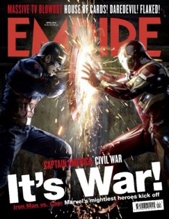 colours so I would be hoping the rest of the magazine to be like that. When it comes to the image on this front cover it again has the contrasting colours and because there are sparks flying everywhere it signifies the power of the characters as well as emphasizing on the cover lines which is “its war!” which is going to straight to the point of the film, attracting the readers. This is good with the audience in mind because they can make that link straight way with just one look at the cover. The last thing I’m going to talk about is the use of language and how that either effects or links to the target audience. With the word “blowout” which is a modern word that is popular with the younger generations, so empire have tried to make that person connection with the audience by coming down to their level and they choice of language. This does further suggest that they have a younger target audience that can be seen as more venerable than adults even thought I have said the TA is 18-40 some 18 year olds and 19 year olds are still able to be vulnerable, in terms of the Hypodermic Needle Theory.
————————————————————————–
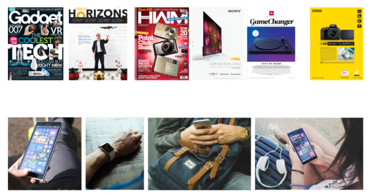
My second example of a magazine that is targeted towards 16 – 25 year olds is Stuff which is a solely based on new, upcoming and current gadget. This, because it is a small, select group of people with a very unique interest, does make it a niche audience. I will be starting with the Demographic Profile for the readers of this and then I will be producing the Phycho-graphic profile for the readers of this as well.
Demographic Profile –
The age range would be 16 – 25 because of many factors of the magazine some may include the genre; the magazine is mainly technology so stereotypically a younger interest, another one may include the language this is because of the younger terms and slang that the magazine uses. The gender would stereotypically be males because the colours used would signify a more male stereotype aswel as the technology been used. When it comes to the ethnicity, racial background and religion again it’s a very broad spectrum because anyone can be interested in it. Id would say that the social economic status would be C1, D, E this is because the people at this level would not stereotypically be able to afford the things in the magazine so they would be aspiring to purchasing them items. As well as this the magazine is cheap at around £4.00, this would attract the younger audience because them may not have lots of disposable income and a lower cost is more attractive. However, it could be aimed as well to the A, B, C1’S because they would be able to afford the things in the magazine, stereotypically, and therefore us it more as a shopping list. The geographical location would be global because it is worldwide bran however this copy is in English so it would be more of the western world.
Psychographic Profile –
The people that do read Stuff would need to be interesting in gadgets and have strong opinions on them because that is what the magazine is mainly based on. When it comes to the “4 c’s”, Cross-cultural consumer characteristics I would say that the audiences would be Aspires and Individual. They would be Aspires because there the people who are seeking to improving them self’s and they would buy high end items to feel better about them self’s and there are a lot of high end items in this magazine. This also goes back to their young audience, at that age they stereotypically won’t have that sort of money to be buying high price5.jpgd items but they want to Aspire to one day owning them items.
I am now going to analyse the front cover of this magazine and discus the common codes and conventions of this magazine and how they, in my eyes, are important.
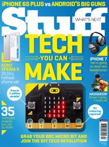 When looking at this front cover the conventions that I can immediately see are; the title, iuoiuimages and the price label in the lower right-hand corner. Most of these are clear to see on this cover but the one that is a little unclear and takes a second to figure out is the title and this is because you have the white title but immediately underneath is the subheading in yellow which is a contrasting colour. So this could be an off putting factor is you were to purchasing the magazine or not. I personally don’t think the extra codes and conventions aren’t that important on this magazine (colours, layout and font) because it’s a technology magazine, if you have the intentions of buying one you’re just going to get it and the title or the logo isn’t going to change that because it has a niche target audience.
————————————————————————–
My third example of a magazine that is targeted towards 16 – 25 year olds is Hello which is a bit different to the last 2 two magazines that I have just talked about because Hello has a mass target audience, this is because it is a Gossip magazine so there lots of different story’s and genres. I will be starting with the Demographic Profile for the readers of this and then I will be producing the Phycho-graphic profile for the readers of this as well.
Demographic Profile –
The age range would be 16 – 50 because of many factors of the magazine some may include the genre; the magazine is mainly gossip so stereotypically a younger and middle age interest with the price of £5.99, another one may include the language this is because of the fact there is a lot more of it in this magazine uses. Another would be that there are older celebrities in the magazine and the royal family is also featured. The gender would stereo typically are females this would be because of a few stereotypical factors one been that the front page is mainly dominated by women giving the idea of that’s what it’s all going to be about and it also says “dream wedding”. When it comes to the ethnicity, racial background and religion again it’s a very broad spectrum because anyone can be interested in it. There media packs say that the social economic status would be A,B, C1’S this is because in this magazine there is a lot of coverage on the royal family and also about politicians and at £5.99 it has the price to match. Another reason to support this is something I have found using HELLOS online media pack; it states “276,000 HELLO! Readers have taken 4 or more trips on holiday in the last year” and 4 holidays a year is quite a few which would suggest that the readers of this magazine have plenty of money to spend, again supporting to the social economic status. On the other hand I would have also said C2’S,D ,E. This is because stereo typically people at that level of income like to nosy what other people, like the celebrity’s, have and what they are doing in their life sometimes to escape there’s but this could be more aimed at OK magazine. The geographical location would be global because it is worldwide bran however this copy is in English so it would be more of the western world.
Psychographic Profile –
Hello’s target audience would have to be interested in what is going on in the celebrity’s life that they feature within the magazine because this is what the magazine is mostly about, the gossip of other peoples life’s. When it comes to the “4 c’s”, Cross-cultural consumer characteristics I would say that the audiences would be Main streamers and aspires. Mainly because the readers of the magazine want to carry on knowing what their favourite royal or celebrity is getting up to on a regular occasion, that why they buy the well-recognized them.
 Here I am going to analyse the front cover of this magazine and discus the common codes and conventions of this magazine and how they, in my eyes, are important.
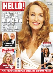
When I look at this front cover the conventions that I can immediately see are; the title so you can see it on a magazine stand in a store, image, cover lines and the price in the lower left hand corner. The main one that you can see on this cover is the image and this does play a key part in wither the reader purchases or not. The photos that are used on the front of the magazine are very important to the reader, the lady in the photo is looking directly at you which makes it more personal and 21links with the title “hello”, it establishes a relationship with the reader from the off. Also the colour red is very eye catching, it also signifies hot, hot of the press, hot gossip. There is more than one image on the front cover meaning there is lots of gossip inside. The big image of Jerry Hall could mean there is a big story on here and because she is looking directly at the camera it could be an exclusive. The text provides anchorage to the photos. Personally I do think the codes and conventions are very important to have on the front covers of these sorts of magazines. I think this because you get a lot of information from the cover, the reader decides wither there going to buy it or not from the stories they see on the cover and if the cover lines or headlines wasn’t there it wouldn’t work as a gossip magazine. Also they do have direct competition with OK magazine so it is important for Hello to get it right.
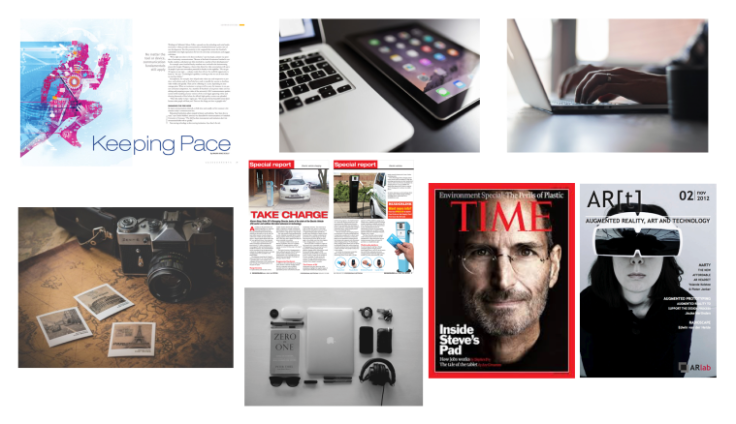
When looking at the comment codes and conventions for a double page spread for my chosen genre the first one that comes to mind is the images that are on the spread and the cover lines that goes hand in hand with them. I personally think this is one of the reasons the reader either purchase or doesn’t because they either like the articles that are I’m that issue or not. I also think the imagery is a big code and convention, this is because the reader most of the time hasn’t got any of the “future tech” or the more expensive items, so they use the images to imagine them owning the items and what it would be like to have them. This also then links to the target audience of been of a young age, this been on the ammonite of words in the magazine. People at that age are not a big fan of reading pages and pages of information, they just want the spersifics to be there and for them to be straight to the point. There are more common codes and conventions when it comes to this genre, some been the title, price tag and colour schemes. Within some magazines in this genre the colour schemes can be a big deal, making the magazine stand out from the competition in any genre is hard and this is no different when it comes to technology. Having contrasting colours helps with making the cover and articles stand out, this is because choosing these types of colours clash off of each other and makes everything pop.
Testing my idea on my target audience –
To test my idea with my target audience I have produced a survey based on my magazine idea and I have done this to see if i have done my research the most effective way I can, and to see if I need to enhance on anything.
I then went on to analysis the results that i had collected.
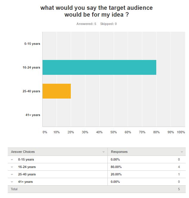
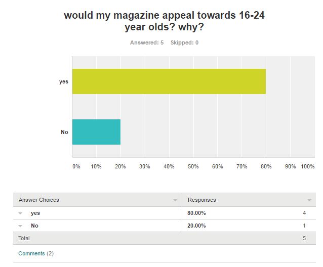

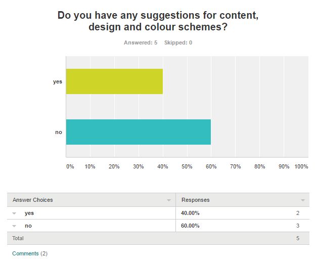
When looking back at my results I can see overall I have been successful with the target audience liking my idea. Also when I look back at some of the comment that have been left for me on the survey, to help me improve my magazine ideas and final product. I have also found out from this survey that my idea can be aged to a 16-24 target audience.
This is one of my first mood boards. In it are a few things that I would like to include or try to build on when it comes to my layout, cover and images. Starting with the covers, there are a couple in this board, they contain lots of information and images right on the front cover. The information that is on there is relevant and enticing to the reader. There is no set colour scheme to this types of covers which is something I would like to change when it comes to producing my own. When it comes to the images across the two double spreads I would like them to be clean and sharp but still have a purpose and meaning. Id like to be able to put them on to the layout in a seamless fashion so this could mean the image been the background so i need to think about the background on the image. The last thing that I looked at for the mood board was different layouts, some that I found included the image taking over a good 60% of the page and then the writing in the bottom corner. Others were equally split in half with a nice colour border.
This is my second mood board. Again in it are a few things that I would like to include or try to build on when it comes to my layout, cover and images but this one takes on a different spin on a technology magazine. Once again starting with the covers, there are a couple on this board but this time there are a bit different. They are clean and have a lot less information on them, in this case they have made the main focus on the image.
MOODBOARD survey
I went and asked my target audience on there opinions of the two different mood boards that I created. Starting with the first one, I asked them what they thought of the front covers, which were on there. I got many different opinions on them, some people said that they liked the way they “displayed information” and “easy to read and understand”. On the other hand others said that they “looked cluttered” and that “there’s too much information been displayed”. I also asked if they like the colour schemes that were been displayed on the boards. Again I got a few different opinions on this, some people said that they were “eye catching” and “contrasting colours” but others said that they were “off putting” and “too bright”. Another question that I asked was, “what are your opinions on the images on the mood board?” people had good reactions to the images that I had chosen for the board, they said that “they are clean and professional looking” and “there straight to the point”. One of the last questions I asked was on the layouts inside the magazines. Here I got only positive comments on a few of which were “easy to see and read”, “all the information was important”. Looking back at these comments I do want to recreate what I have found on this board and adapted on this when creating my magazine.
I then went and asked exactly the same questions to the same bunch of people for my second mood board. To my surprise I had a lot of negative comments on this board especially when it came to the front covers. Some people said “they are very bland” and “there’s no promotion on the front cover, nothing drawing you in.” Another thing that was commented on in a negative way was the internal layout and content, people said that “there’s to much information to read”, “it should only be relevant information”. When it came to me asking about the colours that were represented on this mood board I got some mixed feedback. Some said, “the colours are contrasting so they play off each other to become something that would stand out on the supermarket shelf’s.” On the other hand other people said “the colours are bland and aren’t bright enough to draw you as the reader.” Again looking back at these comments I want to try and uses only certain aspects of this mood board to when it comes to creating my magazine.
TARGET AUDIENCE
So when I asked what magazines my audience read the main one that got feed back to me was hello and other gossip magazines, this gave me lots of information on what the people that I talked to liked and that is to have just as mainly images as there is “useful information.” I also gathered that the people I talked to when and bought the magazine once a month and when they went and did this they preferred the hard copy instead to the online version. When I then went to ask why they did prefer this option they all told me it because they find it difficult to use and read the online version.
CONCLUSION –
So when it comes to making my magazine I am going to be using some of the things that I have found out from these mood boards and my audience research. Some of these include, having useful information on the front cover that draws and incises people in to reading the magazine. Another is using bright and contrasting colours that also grab peoples eye. When it comes to the layout I will be using a simple but clean layout that that looks professional.


Focus group –
Which title do you think suits my magazine;
– Snapped
– Snapshot
– Techno
– Focus
Most people chose Techno, they stated that this is because the other three are very photography based and this could get confusing when looking at the magazine and choosing one to buy. They also said that the name Techno looked good which is a added plus.
When looking at the images for my magazine front cover there were two that they had to choose from –


One person said “I like the one with the white background this shows that it’s very clean and easy to see the main point of the image which is the model in the middle. The one with the yellow glow looks odd and makes the photo dark.”
Another person said “the yellowish one looks like there is dirt on the background and it makes a horrible shadow of the model in the image. This then draws your attention away from the point of the photo.”
FIRST DRAFT –
Apple Watch spread –
Would this make you buy the product? One person said “yes because you have made it technical and advanced by using jargon which is good because it makes it sound like you now what your doing and it would be easy to use.”
From this feed back I have made direct changes to my work base on the helpful suggestions and criticism on my work.
Indesign Techniques
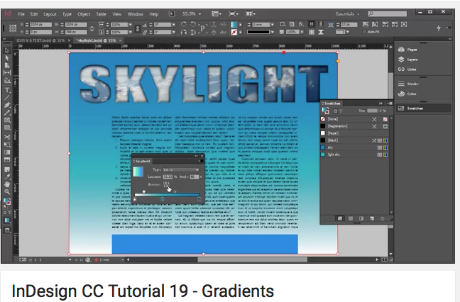
I went ahead and looked at a few tutorials on YouTube about learning a few new skills on InDesign that I could use when it comes to producing my oven double page spreads. So I looked in to one on grading and making you page or stokes more colorful and to add an extra dimension to the spread. I have not tried this technique out yet on a page so I want to see what kind of feel the target audience get from this specific design idea. By just watching this YouTube video I can see that using this tool does give a clean and professional looking spread but I think that does depend on the colours that you do use and if it fits in to the colour scheme and flow of the article.
Font ideas –
When making my second double page spread I formed a focus group to help me decide on a few fonts. I choose three that were my favourite and them put them to the group. The first one was Dissolve which some people thought it fitted well into the theme and looked technical, other also said that it looked like it was changing and transforming. The second font was Development Hell and my focus group said that it was bold and stood out well on the page, they also said that it looked like 90’s film. The last font was Earthorbiter and when i put this one forward to my focus group they said that it looked modern, what i am trying to achieve with my FMP, and futuristic.
So after the feedback that i got on my fonts I choose Earthorbiter because it represents everything that i am trying to recreate when making my magazine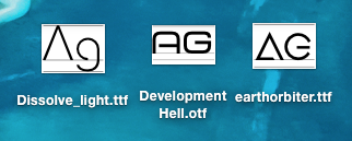
Final product – Focus group
I have gone away and made a survey for my magazine and given it out over social media.

April 4, 2016 at 3:07 pm
Phycho-graphic is one Psychographic
LikeLike
April 4, 2016 at 3:09 pm
In this section here
” The age range would be 16 – 25. The gender would be mixed, both female and male. When it comes to the ethnicity, racial background and religion it’s a very broad spectrum because anyone can be interested in it. Id would say that the social economic status would be C1, D, E this is because it’s not over priced so anyone could afford it and because it is aimed to the younger target audience who may not have a job or only just starting out in a career they can afford it. The geographical location would be global because it is a world wire organisation.”
can you try and develop this much further with more detailed examples as to why you think this is the audience. There will be more than just one reason why you think this audience. Please remember the important of detail examples and discussion.
LikeLike
April 4, 2016 at 3:13 pm
In your analysis of Empire magazine
“The main one for me here is the image, this plays a key role in this front cover because the younger generations know exactly who they are and this is a great signifier.” a signifier of what? try and make your point a little clearer. Talk to me if you need help with this
LikeLike
April 12, 2016 at 10:56 am
A good questionnaire which you could develop further when you finalise your idea.
LikeLike
April 25, 2016 at 2:38 pm
Could you conduct some research into double page spreads as this will help you with your planning for your production?
LikeLike
May 4, 2016 at 12:45 pm
Codes and conventions; well done you have provided a much more detailed analysis with some good examples to support what you are saying. There is still some opportunities to develop this further. Some of your points could have been supported with examples. Well done and keep up the good work!
LikeLike
May 23, 2016 at 1:36 pm
Well done for developing your research further with your font ideas. You have sustained your research throughout your project
LikeLike
June 6, 2016 at 2:35 pm
well done Reece this is a good folder on research. could you develop your findings any more and discuss how these findings link back to your work in more detail?
LikeLike