Entry 1 – 07/03/2016
Today we have been brief on our Final Major Project (FMP); this is to design and create a front cover of a magazine and to produce two double page spreads. I thought of a few different ideas at first but settled with one, which is a technology themed magazine, after I did this everything fitted in to place easier and quickly. After I figured out what I wanted to do I have to put it in to words and create an action plan of only one hundred words which I did find hard to put all the important information in to such little words but I overcame this by just putting the necessary information in to it. I now need to move on to my research to figure out what my audience (16-25) think of my idea and where I can go with it.
Entry 2 – 10/03/2016
Today I have been working through my research portfolio which consists of primary and secondary research. I have now completed the first part of my primary research were I have created my mood boards and handed out a questionnaire to find out what my target audience think of my ideas for my final magazine. I also looked at some InDesign techniques that I was unsure on so I could progress in that area of editing. I finally finished the primary research by looking at codes and conventions for different styles of magazines; for example gossip, technology and film and for each magazine cover I looked at I produces a demographic profile and a physiographic profile which had information from different media packs which helped me to put these profiles together. When producing these profiles I found some harder than other because I personally have never read them and don’t know what they were about, so I had to do some reading first, when I came to writing about the cross-cultural consumer characteristics for the gossip magazine I did struggle so I had to do extra research on that one.
Entry 3 – 15/03/2016
I have now moved on to my secondary research which includes me working on finding what other people have said about my specific genre and target audience. First I started with me finding out what a genre is, which I briefly knew about but did the research to double check, once I found this out I have all the necessary information to put in to my bibliography. I then went on to looking again at the codes and conventions of my own genre which is technology; this wasn’t too hard to do as I had already done this the previous week for just a different magazine cover. After doing this I went on to look at target audiences and why it is so important to understand them and get things right. I found all this information on just a few different sites, one been the NRS (national readership survey) were I easily got all the figures I needed to put in my portfolio.
Entry 4 – 28/03/2016
Since I have been off for the last two weeks I have completed my secondary I finished this off with my conclusion which included my aims and conventions of my magazine. I have written about my final ideas for my two double page spreads and front cover which are “I can conclude that my aim is to produce a double page spread and a front cover on technology. One of my article and double page spreads will be on how technology has changed throughout three generations and the other a review”. I know need to complete my rationale which will help me to go ahead and start to make my magazine.
Entry 5 – 4/04/2016
Today I have completed my Rationale which is a short statement in to what I am going to produce and why I am doing it. Concept, which is an in death statement in to what my double page spreads will be about and my front cover and my evaluation which is me talking about why I am writing a reflective journal. Today I also looked in to doing more research but this time I when and looked into a magazine, which turned out to be useless and not relevant (it linked in my bibliography).
Entry 6 – 7/04/2016
Today I have started to produce my proposal presentation which I will be sharing with my class in a few weeks’ time. I have added my rationale and project concept to this presentation and started to look at image ideas and front covers. I now know that I need to look more in to cover and image ideas and I need to add my evaluation of my rational and project concept. This has made me go back and reread all of my work which then leads me to add more and more improving it which I hope is an on-going occurrence.
Entry 7 – 14/04/2016
Today I have started to take some test photos for my double page spreads; I have taken as many as I could with what I was given. This has helped me to think about the colours and lighting a lot more because simple things like that add so much to the image. A big problem I had to face and sadly didn’t overcome was the camera I borrowed from college only had a small amount of charge so I couldn’t get as much as I want to but that should be different next time I plan a shoot.
Entry 8 – 18/04/2016
Today I came back and finished my presentation off read for showing it to my class and tutor next week, I then can get more detailed feedback to further improve my idea and work I have done. After doing my PowerPoint I have gone and wrote a draft piece for my review and article this has started to give me more and more ideas of what I can write when it comes to my production of this aspect. I have sketched some designs for my front covers and how they are going to look. By drawing my ideas out it help me to visualize what I am aiming for and how I want it to look. I drew a few different ones and chose the best two that I thought out appeal to my target audience but I will find out for certain next week at the presentation. The problem that I have had to overcome when making my sketches was that I had so much to get in to my design.
Entry 9 – 22/04/2016
Today I started to write up my article on my review of the Apple Watch, I feel like some things went better than others. One of these things included putting more emotion in to the writing so it made the reader have and urged to go away, after reading my piece, and buy one of these watches. So I went back and added more detail in not my writing when I came to the emotional side of the article. Another thing I have done today is finish off the presentation ready for next Monday. When it came to finishing it, the problems I had to overcome was not writing that much so it was easy to read when it comes to standing in front of the class and talking about it.
Entry 10 – 25/04/2016
Today was the personation which went well; I got many positive points and some constructive criticism. Some on the way I do my presentations and that’s what I’m going to talk about now. I was told that I might help to just put small bullet points together and then just talk free about what they mean. This will help me I think because one problem I had was stuttering because I wanted to add more but then couldn’t link it back to the presentation. I will use these helpful points to improve my next presentation which will be in a few weeks.
Entry 11 – 03/05/2016
I have started to take my second load of photos for my next article which is “how technology is changing.” I have taken my some of these outside so I can have something to compare to when I go in to the studio this afternoon to take clean white images for my front cover. some of the problems I may have to over come is the lighting because I don’t want any streaks of off white balance. To overcome this I will make sure there is some shadow on the face so it looks as real as possible. I now need to take my images and edit them whilst taking screen shots so I can do further analysis on the way I have been editing. This will impact my FMP because the images will look professional and well taken.
Entry 12 – 10/05/2016
Today I have started to make my first double page spread which included using indesign and many other new tools that I have never used before today. One of them included just the simple line tool but by changing the stroke (shape) of the line it created some cool patterns that links well with my genre I did this because in the finial outcome it will be more suited to my target audience. I also talked to my tutor about doing some audience research which helped me to decide on doing a focus group about my first double page spread, hopefully involving:; colour, layout and fonts. I have also had a contestation with my class mates and tutor about the article on the apple watch and i have realised that i may need to add somethings in to this pieces, for example that the most expensive model is over £13,000 which includes 18 carrot gold trims. This piece of information was a total shock to them so I think this would entice a lot of people to come and pick up my magazine.
Entry 13 – 13/05/2016
Today I started to work on my front cover design. I started by holding a focus group to decide on my title, I had 4 ideas; Snapped, Snapshot, TechKnoW and Focus but people pointed out that the only one that stood out is TechKnoW and this is because the other names were very photography based. This is relevant to my FMP because my aim is to produce a Technology magazine, not just a photography magazine which is what my focus group thought the other names were. I also edited my photos for my front cover, I started by making my images sharper with the effects tool, then I choose to make my image black and white which my focus group said looked “tech like” then by adding a block font to tie the two together.
Entry 14 – 16/05/2016
I have now started to make my second double page spread, starting with a visual timeline so people can see what i am talking about and not just trying to imagine it. This should hopeful not my FMP to vague and more straight to the point. I have also called a focus group together so I could decide on a good font that represents my magazine. I choose 5 fonts and put them to 5 people, this gave me a great range of feedback. people have said to me that a thinner font would not suit my magazine because it could “get consumed” by the photo behind. So this lead me to choosing a thick font that spreads across the whole page at the top. This is relevant to my FMP because producing a magazine you want people to see the title on a magazine stand and by having the title at the top this will allow this. If I had chosen to have it down the side or in the centre people wouldn’t know what it was.
Entry 15 – 17/05/2016
Today I have stared by holding a focus group to decide what fonts to use for my second double page spread I had three that I thought were good. The focus group decide on a clear winner and this will now help me when putting together my spread. The one that they all liked had a technical theme so thats the one I am going to use. This will help me when it comes to my FMP because it will have a more direct link to my target audience and original idea. After looking at my fonts and holding my focus group I went ahead and put some images on the page, the first image I put in was in colour and had a very strong green background so I decide to open this image up in photoshop and change it in to black and white. After I did this I put the image back on my spread but still it didn’t look right, I asked another person for there opinion and they said the same. I went back to the images and looked though them, after finding another one I loaded it straight in to photoshop because at this point I have decide that its going to be black and white. I changed the image in to the black and white then put it on the my double page spread and this is now what i am going to uses for my FMP.
Entry 16 – 23/05/2016
I have completed my double page spread today, I held an interview with Ricky Payling and Lynda Green they both gave me insight in to what technology means to them and how they use it. Putting this together with Miya Biggin it will give me a broad spectrum and it will help my FMP because its what my initial aim and using all this will have a direct link to my target audience. I have now exported my magazine as a PDF and sent it to get marked. I have now stared my Evaluation and because of this i have gone away and produced a survey for my final products which has helped me to write about what has gone well and people like and what had gone wrong and if i had the opportunity again what i would inprove.
Entry 17 – 26/05/2016


 turning down the opacity it still catches your eye but its not distracting.
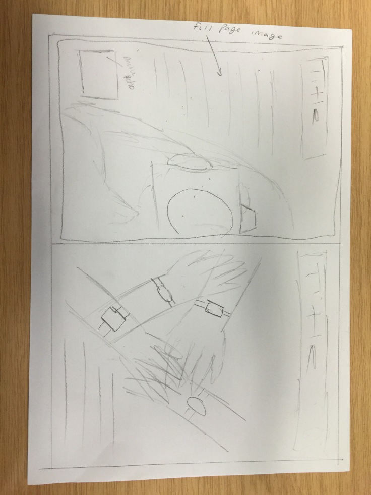
 whole page so I thought rounding the corners would make it more eye-catching and easier to enjoy. Then I added in my text and added in my drop cap and the giant A on the background this representing the Apple Watch in the article. Then when talking to my tutor he said that i should add something to make the article look more like a technology article so i did this by adding in the different snapped lines. Then I went ahead and added my codes and
  conventions like the name of the magazine in the left hand corner and page numbers.
 without reading any of the words But i did change the opacity of the image because at first


Recent Comments